
Hopelessly in love with clean code and unobtrusive design!
Designs for HCAI summer school
Posted on Jul 28, 2019
A small writeup on what went into designing the name tags, posters and standee for the SIGCHI-sponsored summer school on HCAI.
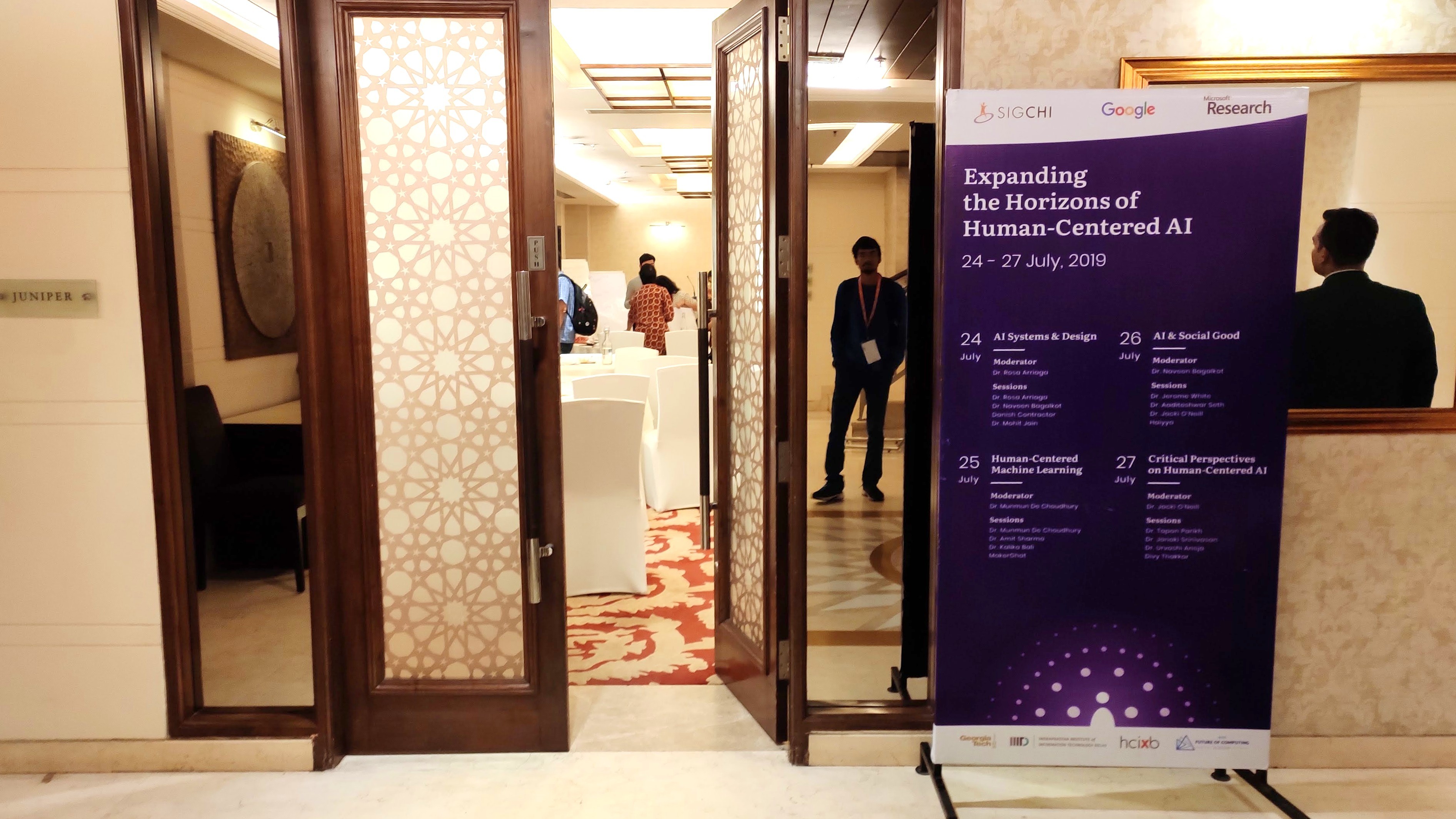 The standee was placed at the conference room entrance at the India Habitat Center, New Delhi
The Summer school on “Expanding the Horizons of Human-Centered AI” was an HCI Across Borders event in cooperation with the ACM Future of Computing Academy. It took place in New Delhi, India, from July 24 to July 27 2019. It was hosted by the Indraprastha Institute of Information Technology in Delhi with the organizers being Neha Kumar (Georgia Tech) and Pushpendra Singh (IIIT-Delhi).
Designing identities for an organisation is a design activity that is close to my heart. While my initial foray into design in general started with designing posters for events for my institute (which I have continued throughout my three years there), I feel that designing an identity allows for a design exploration at a deeper level. What does the organisation stand for? What are its core values? How can one capture these faithfully using design elements and style guidelines? When I volunteered for designing the promotional material for the summer school, such were the questions that I framed to guide my design.
Then there were the unique affordances of the sizes of the prints themselves. The biggest print was for the standee, which was to be as high as a person if not more, while the smallest was for the nametags. They were meant to serve different purposes; the standee had all the speakers’ names along with the event name and logos, the podium poster was to be visible as the speakers gave their talks and the name on the nametags would have to be visible clearly as people introduced themselves to others. The initial designs that I made for these, though served the purpose, looked quite bland and characterless. It was time to put in some uniqueness through an interplay of colour and shapes! After a few explorations with circles, the idea of representing a network of people through concentric circles struck my mind. The circles could represent people seated in the conference room or nodes in a neural network (an idea central to today’s AI research) too! The expanding radii of the circles could signify the dissemination of knowledge, just like a teacher imparting knowledge to her students, who might each then go on to spread it to other communities. Finally, I modified the innermost circle to resemble an icon for a person, which was to hint at the “human-centered” idea at the heart of the event.
Now it was time to decide the colour schemes. I was given a beautiful blurred out photo of a cityscape full of lights at night that I could use in my designs. The picture had featured at various places in the circulated forms and on the website, so it held a special meaning for this event. The SIGCHI logo had a shade of orange, but trials with white text over orange led to low contrast, and darker shades looked dull. A dark shade of blue seemed to do the trick in the end, as it could also represent space and horizons with the circles representing stars while providing ample contrast when paired with white text. A simple gradient emanating from the human at the centre of the shapes bolstered the sense of expansion and rising above the horizon, both relevant themes for the event.
The selection of typefaces also posed an interesting problem. I settled on using Literata for the headings and Poppins for the body, as they went well together and were offered in a variety of weights. They were provided for free by Google Fonts, which also left the option open for web / digital usage. To make each nametag unique and spark interesting conversations, the nametags featured a small white space at the bottom, inviting one to fill it with words and creative doodles. It could also be used to put in additional contact info that one might want to mention.
Even though the designs were complete, as the day neared to print them out, I was still sceptical since I was not available at the place of print to see how things were turning out. However, the fears turned out to be irrational and the prints turned out pretty well. The nametags did look a bit stretched out vertically, but otherwise, the colours looked great! I would like to sincerely thank all participants to have accepted my designs and used them throughout the four days! I also want to thank all people involved in the designing, especially Anupriya, Pushpendra and Neha for bearing through and answering all of my questions (sometimes repeated and stupid) and providing valuable feedback right from the start. This event has been a very fulfilling journey for me, and I thank everyone for making it the grand success that it was!